Company
GE Healthcare
Year
2018 – 2020
Type
Design Pattern
Data Grid
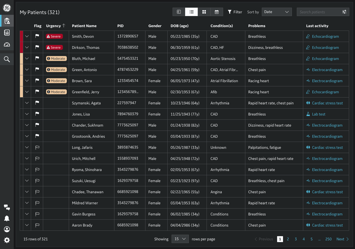
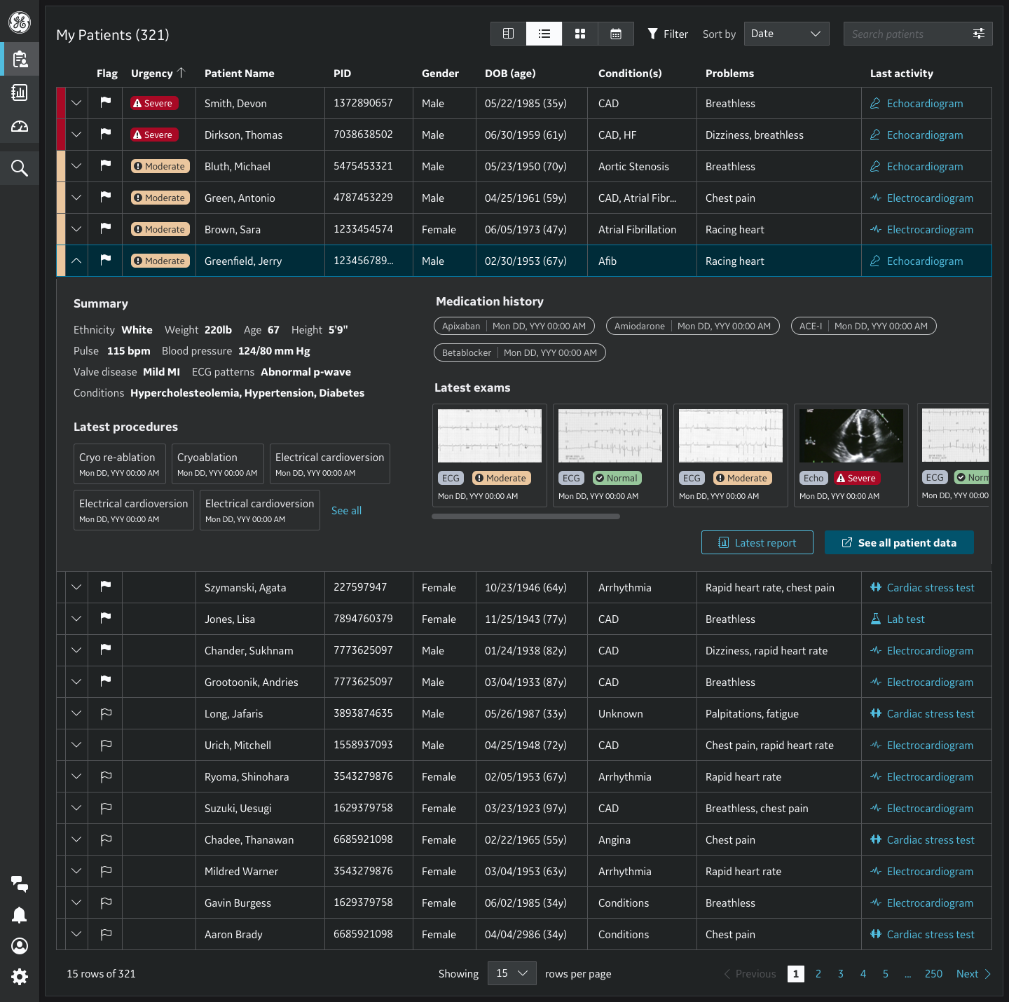
The data grid component is useful for displaying tabular data and provides more functionality than a simple table such as searching, filtering, sorting, and inline editing.
General Electric Healthcare
With a century creating hundreds of products sold in 100+ countries, GE Healthcare is best known for our medical products: XRays, CTs, MRIs, ventilators, monitoring devices. Today, healthcare is based increasingly on intelligent software.
The Problem
Although known for excellent product engineering, GE Healthcare consistently received feedback from customers that our products appear dated and operate as if they were created by different companies. Previous attempts to create design systems at GE Healthcare had failed due to the sheer number and complexity of our products, as well as the diversity of the personas and workflows.
Goal
We set out to create a platform: a componentized design system of visual styles, elements, and interaction patterns, providing both engineering and design efficiency for hundreds of teams at GE Healthcare, and aligning them to brand principles.
UX Challenge
There was no unity, cohesion or consistency in in the way data grid was used across products. Risk to effective, intuitive, safe care delivery and saving lives. Customers complained frequently that our products appear dated and operate as if they were created by different companies.
A Defined Process For Success
Community is front and center of the design system. The roadmap and upcoming meetings were published, as were upcoming trainings. The design community met weekly to provide design feedback; most design specs go through several rounds of review before release.

Research
Research encompassed a variety of investigative methods used to add context and insights:
• Defining GE Healthcare use cases
• Heuristic evaluation
• Prioritization Survey: Prioritize features of Data Grid based on input from the community
• Collaborate with Dev Team: Understand implementation constraints through talking with the engineering team


Survey Result RACI prioritization of Data Grid features
After prioritizing features of Data Grid based on input from the community, a clear Data Grid MVP scope was established based on which features were absolutely necessary in providing value to the customers and business.


Previous Data Grid features audit versus new requirements.

Data Grid requirements

Personas


Data Grid Anatomy
The basic anatomy of the data grid pattern is comprised of 10 primary baseline and interactive elements.

1) Row check box. 2) Sort button. 3) Column heading. 4) Overflow button. 5) Global utility actions. 6) Table-wide search. 7) Row utility actions. 8) Pagination Rows. 9) Rows. 10) Header row.
Interaction States
The data table’s row hover state helps the user user visually scan the columns of data. The toolbar and rows follow interaction conventions found in other Edison DS components. Buttons, checkboxes, radio buttons, overflow menus, search, and expanding elements can be found in the data grid and all behave the same way across Edison DS components.

Data Grid Spacing
Spacing, as it is utilized throughout the Edison DS, is based on increments of 4px. Having all increments divisible by 4px ensures alignment to an underlying 12-column responsive layout grid.

Final Design
Adaptation Showcase
The following showcase example of how the data grid pattern is currently being implemented.


